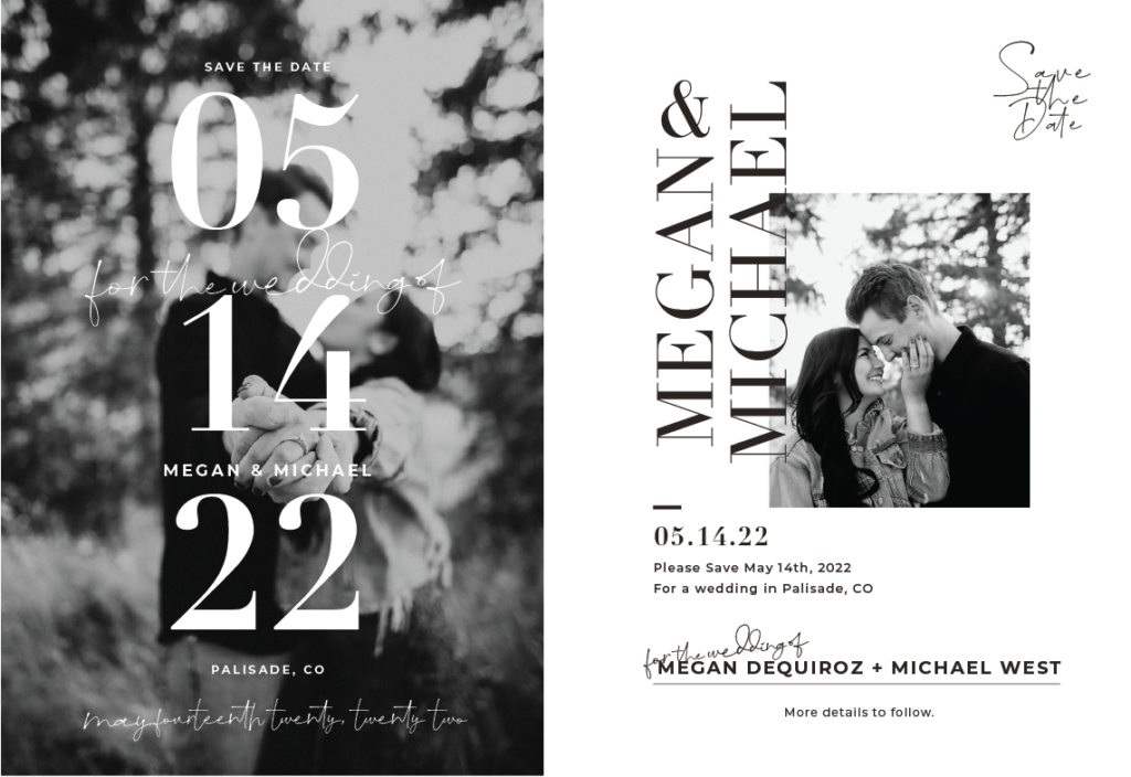
by megan v west
We’re so excited to be wedding planning and a lot of things we’re taking on all by ourselves!
One of those things I volunteered to do was a lot of the print materials for our wedding. I mean, after all, I do this for work full time, I think I could figure out how to get these things printed and squared away! Below is a GIF that depicts how excited I am to be taking on a ton for the planning! I LOVE getting nitty-gritty, and down into very specifics for details!

I wanted to share my thought process. Obviously gravitate towards fonts that are on my website, and in my logo. The script fonts I love need to look as close to handwriting as possible, and the serif fonts are a must for me! My logo is made of Paris as a script font, and Didot as the serif component. For our invites, I sort of had the same idea since I’ll probably build our wedding website in a similar way to how I style my site anyways! The other fun part about our wedding is that we chose really timeless/ classic colors (black, white, grey, light blue, light green, and tan). When you design a save the date or wedding invites you to want to bring the feel of the wedding into the stationary. 🤍 If my Pinterest board for Summer Wedding has you feeling inspired, this might be the template for you!!!